

The online shopping experience is often an experience split into two:
- Browsing experience – an exploratory and iterative process, with lots of vibrant product images, convincing copywriting, reviews from other shoppers, feature comparisons, etc.
- Checkout experience – a predetermined linear flow, with lots of form fields, instructions, potential error messages, and slow loadinghttps pages.
This often makes the checkout process feel detached from the rest of the browsing experience. And while from a technical perspective this is often the case too, that doesn’t make it good UX design.
In this article we will look into how product thumbnails can be used to create a checkout experience that is more in tune with the browsing experience. More specifically, we will focus on how product thumbnails can be reused throughout the customer’s entire shopping experience in order to close the gap between the browsing and checkout experience.
Showing Product Thumbnails During Checkout
A more coherent checkout experience will typically be perceived as simpler to complete as it minimize user alienation (due to familiar and consistent UI elements). Besides a consistent visual styling and general layout, one way to tie the browsing and checkout experience together is by injecting product thumbnails into the checkout process – adding them to the cart page, review page, and even the order confirmation e-mails.
1) Cart Page
The cart is the first part of the checkout process, making it a good place to start adding product thumbnails for each new item in the cart. These thumbnails are not supposed to be new imagery (in fact, that would ruin their purpose) but merely a resized and repositioned version of the main product image sourced directly from corresponding product page(s).

Having a cart thumbnail for each item in the cart provides a strongvisual clue that tie the cart content to the product page(s) in a rich and resonant way compared to the merely showing a line of text for each item.
As an additional bonus, product images in the cart will also serve as an instant visual confirmation to the customer, literally showing that the right product was indeed added to their shopping cart.
A review of the top 100 e-commerce sites we’ve done in April 2012 revealed that 86% of these sites display product thumbnails on the cart page.
2) Order Review Page

Some sites – such as Macy’s seen above – show the product thumbnail on the “Order review” page, which can help put the customer at ease at this vital moment. Even if the customer only has to click a “Place order” button, it’s a critical moment where they decide whether to fork over hard-earned cash or not. Here the product thumbnail can help reassurethe customer that she is in fact purchasing the right product(s), or simply acting as a visual reminder of why the customer “must own” this product.
Our benchmark of the top 100 e-commerce sites (conducted April 2012) revealed that 60% of those sites with an order review page displayed product thumbnails on it.
3) Order Confirmation E-Mail
One last obvious – but often forgotten – place to show product thumbnails is in the order confirmation e-mail.

Having product thumbnails in the order receipt e-mail is a nice way toshow the customer she made the right decision by literally showing what is currently being sent to her. While the customer has committed herself to your store by placing an order, confirming that buying was the right decision is still important for the overall shopping experience and can likely help lower order cancellations and returns.
Reusing the visual style from your website in the order receipt e-mail helps establish a more coherent brand experience, and combined with product images the e-mail becomes a visual testimony to the customer’s decision. As an added bonus, the e-mail is also a lot easier to recognize if the customer has to find it at a later date.
Implementation
While implementing product thumbnails into the checkout experience is seemingly straightforward, it is important to get the details right in order to avoid confusing or inadvertently distracting the customer.
Consistent Imagery
In order to avoid confusing the customer, make sure that the product thumbnail is simply a downscaled version of the default product image and that it matches the customer’s selected product variation (e.g. showing a picture of a red t-shirt if that is the color the customer has selected).
Showing a downscaled version of the default product image is important because it increases recognition. So while your e-commerce site should feature a wide array of different product image types on each product page, the checkout thumbnail should in (almost) every case be the first image in your product image gallery – the one that is shown to the customer by default. Most sites do get this right, but there’s still a few that don’t.
A more common mistake is using the same thumbnail for all product variations despite an obvious aesthetic difference. For example if a customer selects a “Blue” variation of a t-shirt but sees a thumbnail of a red tee in the cart, she may think she selected the wrong variation or that there’s an error on the site – even if the variation “Blue” is written in clear text in the cart description.

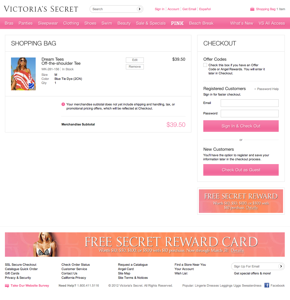
If you for technical or practical reasons can’t serve a distinct thumbnail for every product variation (such as color) then you can alternatively choose to serve a black/white thumbnail with a small color-overlay as seen above in a slightly modified version of Victoria’s Secret’s cart page (see full-size original). In Victoria’s Secret’s implementation the blue color variation overlay is tad too small but in general this is a valid “variation overlay” technique to employ in case you can’t show a distinct thumbnail for every product variation. Desaturating the original image is important to underscore that the variation overlay is the selected color.
Keeping Focus on the Primary Action
Product thumbnails tend to stand out and demand the customer’s attention, which means that careful implementation is required to avoid inadvertently distracting the customer from the page’s other elements – such as a “Place order” button. It’s therefore important to consider the overall checkout flow and complexity of each checkout step (this will of course depends greatly on the site’s unique design and must be evaluated on a case-by-case basis).
One common issue that sites with product thumbnails must deal with is that the each product line will most likely take up a significant amount of vertical space – pushing down other content on the page. It’s therefore important to consider what content is being pushed down.
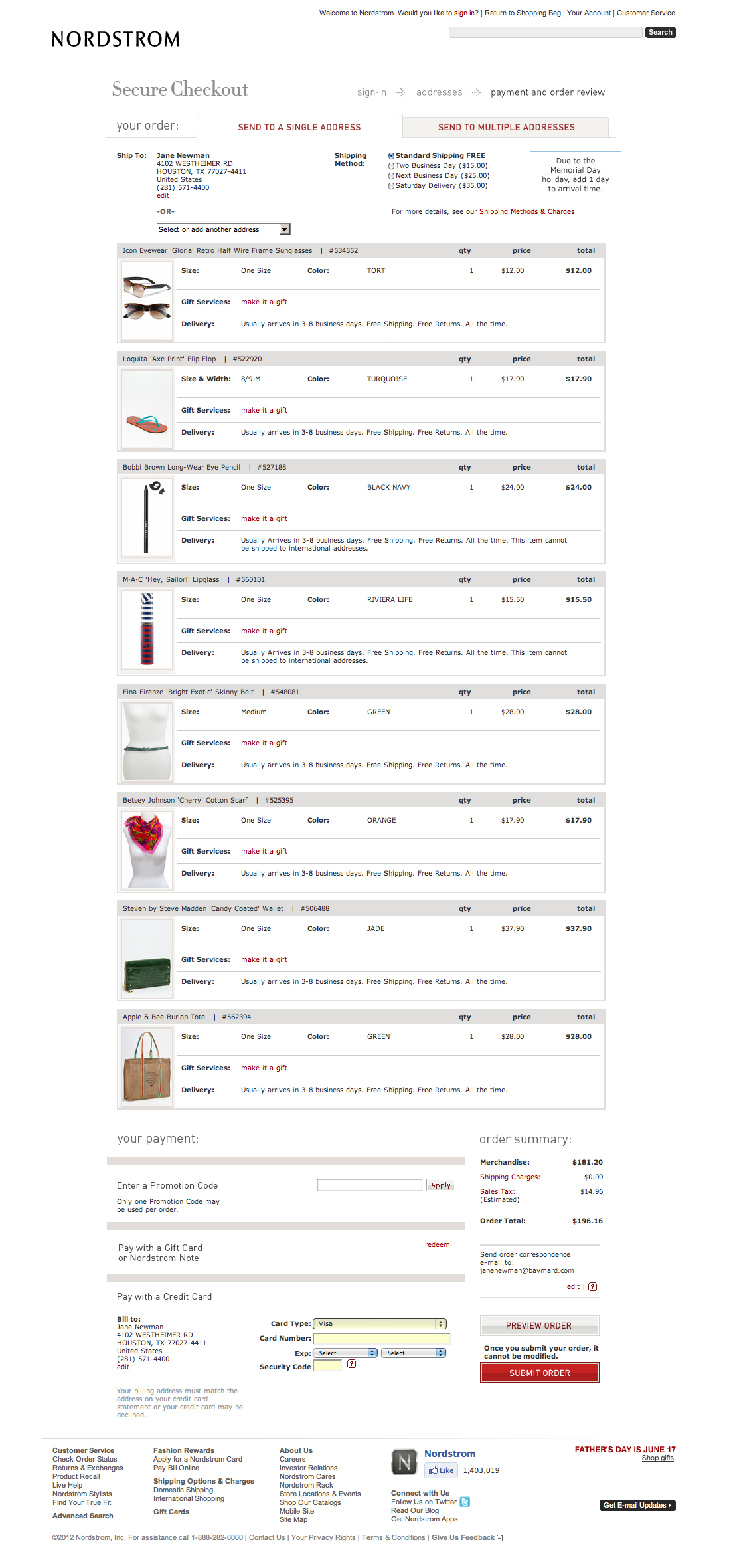
For example, what happens if a customer purchases six different products? If the “Place order” button is pushed too far down on the Order Review page the customer may accidentally mistake the page for being a Confirmation page rather than a Review page. During ourcheckout usability study we found that while the test subjects didn’t have any significant problems scrolling below the fold, they relied heavily on the content above the fold to figure out what they were expected to do at each step.

Nordstrom’s order page with eight products in the cart. The credit card fields and red “Submit Order” button are pushed far down the page. (See full-size original)
So when you add thumbnails to your checkout steps carefully consider if any content related to the “primary task” is being moved out of sight. Ways to avoid this can be by either placing the product line items (or the primary action) in a sidebar, or by having two primary buttons (one above the cart and one below). Dynamically making the thumbnails smaller based on the number of items in the order (or removing them altogether) is also an option.
A Coherent Shopping Experience
The overall concept here is simple: inject some of the visuals from your product pages into the otherwise dull checkout process. A review of the top 100 e-commerce sites in the world reveals that 86% display product thumbnails on their Cart page, and 60% display product thumbnails on their Review page.
Besides basic reassurance that the right product was indeed added to the cart, product thumbnails increase the coherency of the overall shopping experience as there’s a visual tie between the product page and the checkout experience. In the same way that a logo placed on all pages brings recognition to the website as a whole, a product thumbnail displayed throughout the checkout can bring recognition to the purchase process as a whole.


Amazing information, I would definitely com again soon enough for more updated content about best online shopping stores. Love your work
ReplyDelete