The advancement of web technology has led to some incredibly impressive improvements in online application interface design. Below we’ll look at 20 web apps that aren’t only extremely useful, but indisputably attractive as well. I’ve subdivided the applications into four categories: Design, Business, Productivity and Miscellaneous.
Like the article? Be sure to subscribe to our RSS feed and follow us on Twitter to stay up on recent content.
Design
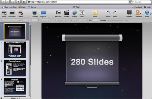
280 Slides
280 slides is an absolutely amazing free alternative to Powerpoint and Keynote for making professional or personal presentations. The interface is beautifully streamlined and feels as nearly as good as those from Apple and Microsoft.
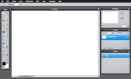
Pixlr
On one hand I can’t help but think that the Pixlr interface is a near straight ripoff of Photoshop. On the other hand the resemblance to Photoshop is everything I like about it. Though by no means a suitable alternative for professionals, it’s definitely a fun, simpler image editor for beginners.
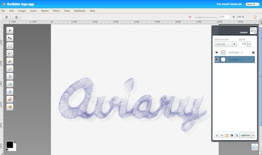
Aviary: Phoenix
Aviary’s Phoenix is another well-designed online image editor. Again we see some strong Photoshop similarities with a bit more unique creativity thrown in. All of Aviary’s tools are simply top-notch and are built with an amazing richness of features and power.
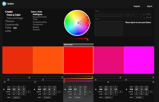
Kuler
Kuler is my preferred way to build color schemes. The interface is incredibly simple to use, yet powerful and attractive.
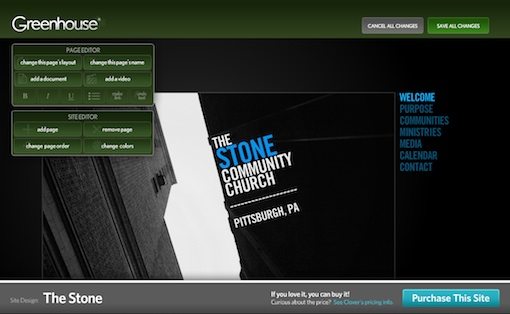
Clover
Clover provides prefab websites for churches and ministries. Each site comes with a built-in editor called “The Greenhouse” that makes it a breeze to customize a site on the fly. If you stop by the site you can demo The Greenhouse on various site templates without even signing up!
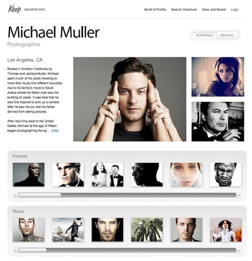
Krop
Krop provides creatives with an incredibly easy way to build a beautiful online portfolio and resume. Simply choose from one of the pre-built templates, upload some images, drop in some text and you’re well on your way to impressing potential clients and employers.
Businesss
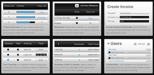
Subernova
Subernova is task management on visual steroids. Similar in concept to Basecamp, but a whole lot prettier. The key here is contrast. There are lots of light gray gradients offset by black and blue for objects that the designers want to call your attention to.
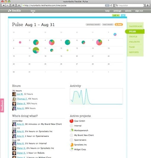
Freckle
Freckle is a serious time tracking professional suite with a light hearted interface. The bright colors and easy to read charts swap out boring for beautiful in the normally mundane task of tracking your hours.
CoTweet
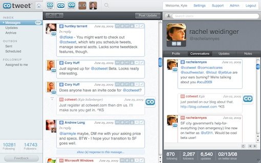
CoTweet is targeted at businesses using Twitter to reach their customer base. The intuitive and attractive interface makes it a breeze to collaborate on and schedule your professional tweets.
InvoiceMachine
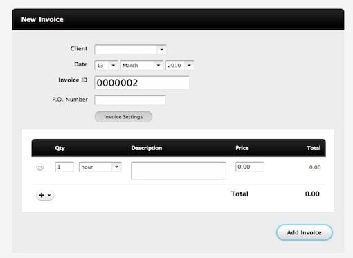
The InvoiceMachine opts for a dead simple but very attractive interface heavy on dark/light contrast like Subernnova above.
Outright
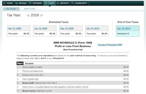
An entrepreneur’s dream, Outright is a way to track expenses and perform automatic bookkeeping operations for self-employed individuals and small businesses. The interface uses simple zebra striping and minimalist icons to make it easy to sort and navigate through lots of information.
Ballpark
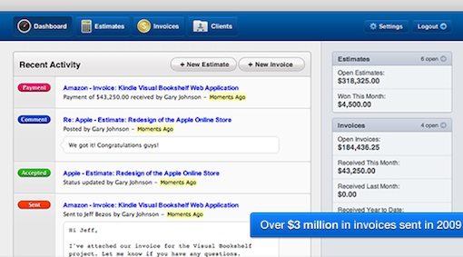
Ballpark is another app that makes it easy to build and track invoices online. Quality icon design and bright colors are the key to this excellent interface fromMetalab.
Productivity
Scraplr
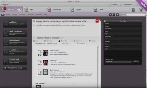
Scraplr is an impressive online productivity tool that boasts an interface as rich in features as you’d expect from a pricey desktop todo app like Things or The Hit List. It’s still in private beta but you can get a sneak peek of the features and graphics at their site.
FocusBooster
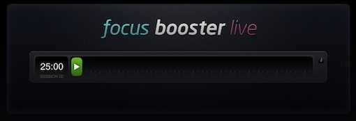
FocusBooster is a simple web timer meant to help you stay on task for specified periods of time. The idea is that while the timer is going, you should strive for distraction free productivity (sorry Facebook, you get a turn after the timer ends.) The timer is a beautiful piece of art that features a simple start and stop button and a progress meter.
TodoTweet
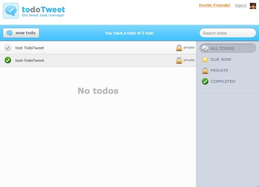
TodoTweet is an interesting concept that lets you use Twitter to create todo lists. I honestly don’t think Twitter is the best medium at all for this task but the interface is nice enough to make me consider changing my mind.
TeuxDeux
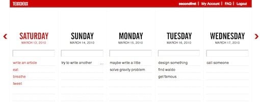
TeuxDeux features one of the most wonderfully simple interfaces of any ToDo app I’ve come across. Simply type your todo under a weekday header. This allows you to spend most of your time performing tasks, not creating and managing lists.
Miscellaneous
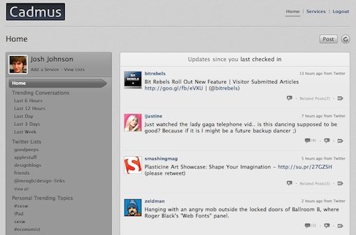
Cadmus
Cadmus is a social media aggregator that combines your Twitter, FriendFeed and RSS feeds into one nice muted gray interface.
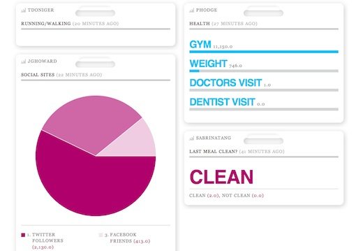
Daytum
Daytum is a handy tool that lets you track absolutely anything you want with absolutely beautiful minimalist graphics and colorful charts.
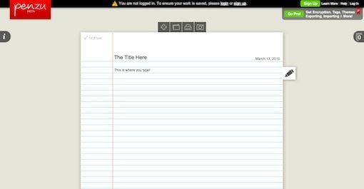
Penzu
Penzu is a simple journaling app for keeping your private thoughts organized online. The interface features a simple notebook paper theme that cuts out all distractions while looking familiar and friendly.
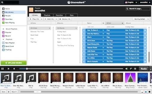
GrooveShark
Grooveshark is one of my favorite ways to listen to music online. The main reason for this is that the rich interface feels more like a full-scale desktop music application than a webapp. Searching for songs, making playlists and browsing your library is nearly as easy as in iTunes!
Conclusion
The stellar examples of web application design above can be great inspiration for your next web project, application or not. Consider the usability strengths and weaknesses in each of these apps and how you can apply these principals in your own UI design.
Use the comments below to let us know which app is your favorite, both for functionality and design.


No comments:
Post a Comment