This is the first in a series of 8 articles on checkout usability that combine findings from ourcheckout usability research from 2011, and our 2012 benchmark of the 100 largest e-commerce sites (database coming soon).
When we conducted the checkout usability study last year we discovered that whenever an “Apply” button was used to submit only a section of a checkout form it was either:
- Not clicked, even if the related input field was filled out, or
- Mistaken for the primary button.
More than half of the test subjects were confused by e-commerce checkout forms with an inline “Apply” button. The test subjects simply didn’t understand the concept of having a separate “Apply” button for distinct sections of a form – i.e. for applying a shipping method or a coupon code to the order. Instead, the subjects expected a single primary button in the checkout flows which would submit everything and take them to the next checkout step.

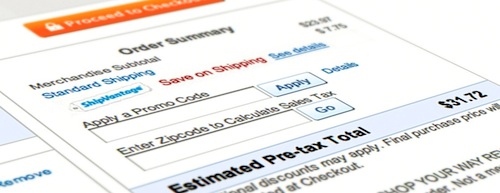
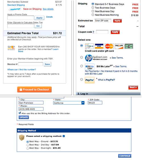
6 “Apply” buttons all potentially causing confusion and needless friction as we will examine in this article. Checkout steps from the top left: Sears, HP, and PC Connection.
When we benchmarked the checkout process of the 100 largest e-commerce sites we found that 72% made the mistake of using an “Apply” button to submit distinct sections of the checkout form. These “Apply” buttons were typically used to submit zip codes for shipping calculators, applying coupon codes, or updating shipping selections and cart quantities.
The Problem
Let’s start by taking a closer look at the two-pronged problem we observed where “Apply” buttons are either 1) not clicked, or 2) mistaken for the primary button.
When testing Newegg’s checkout, only half of the test subjects who filled in their zip code also clicked the “Go” button. This relates to the first part of the problem, namely that users don’t click the “Apply” button. It simply wasn’t obvious to the test subjects that they had to submit the selected shipping option separately in order to see the shipping cost – after all, they had already chosen the shipping option and thus expected to see the cost immediately. While there may be technical reasons for these implementations, there aren’t any obvious interaction reasons. To the user, the request has been made – having to submit the selection is illogical since the very act of selecting it should be considered sufficient intent.
During Newegg’s checkout only half of the test subjects who filled in their zip code also clicked the “Go” button (click for full view).
The second part of the problem – users mistaking the “Apply” button for the primary button – is related to the notion that users generally don’t expect more than one button in a checkout form, so when they see one, they leap to the conclusion that it will submit the entire form and take them to the next step. This misconception can obviously be a critical problem since it can effectively halt the entire checkout process for a customer – potentially leading to abandoned orders. Below is a form from American Apparel’s site, where some of the test subjectsmistook the “Apply” button for the primary button.
During testing, American Apparel’s “Apply” button was mistaken for the primary button, leading to great confusion as it didn’t take the test subjects to the next step as they expected (click for full view).
When a user clicks an “Apply” button, thinking it’s the primary button, the expected flow is broken as she won’t actually proceed to the next step of the checkout. In these cases most of the test subjects began looking for error messages as the page had reloaded yet they hadn’t progressed to the next step. However, since the clicked “Apply” button was applying local changes and not submitting the entire form, there (obviously) weren’t any validation errors to be found, which just confused the test subjects even more.
Styling and Micro-Copy
While the frequency of this issue depends on the visual similaritiesbetween the “Apply” and primary button, it was clear from the usability test that it’s not possible to avoid the issue by merely using distinct button stylings.
Furthermore this issue is in not limited to buttons with the name “Apply”, but applicable to nearly all buttons that apply, update or submit, only a specific input or selection within a form. The test subjects ran into the same problems when other contextual words such as “Go” or “Submit” were used for button naming.
The only exception to all this was the “Update” button for product quantity at the cart step. The test subjects never mistook this button for being the proceed button (problem 2), but in some cases it wasn’t clicked even though the user changed the quantity (problem 1) – and therefore this isn’t exactly an ideal implementation either.
In short: while restyling and renaming “Apply” buttons within a form can somewhat lessen the problem, it doesn’t fully alleviate it.
A Solution: Auto-Update
If you need to update a value before moving on to the next step (and often you do as it is generally good usability to reciprocate a user’s action with instant and responsive feedback) then auto-update the value using AJAX instead of using an “Apply” button.

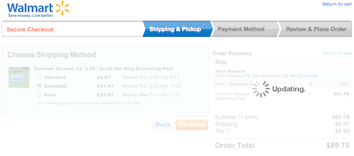
Walmart’s checkout is a great example of auto-updating the user’s shipping selection instantly instead of using an “Apply” button within the form to update the order total.
Removing the inline “Apply” buttons obviously resolve the issue of the user overlooking it (problem 1) and eliminates the risk of it being mistaken for the primary button (problem 2). This way you avoid sub-actions within the form-step, ensuring the checkout linearity that users expect from your form steps.
When it comes to auto-updating input fields of a more open format, such as a text field, you have to consider at what time you should auto-apply the value using AJAX. If there’s multiple ways of writing a correct input then you could do it as the user types (e.g. revealing availability of a username as the user types, or the correctness of a password). If there’s only one correct way of writing the input (e.g. a coupon code with a defined set of characters), then you should only try to apply the value when the field loses focus or when the input has reached the correct number of characters (to avoid any inline error messages while the user is still typing). Alternatively, when the field receives focus you may show an “Apply” button that’s visually integrated with the field, and then hide it again when the field loses focus – although this should still be combined with auto-update.
Avoiding “Apply” Buttons
This is a very easy problem to screen for. Generally speaking, whenever you have a button within your checkout process which isn’t the primary button for submitting the entire form, there’s a good chance it’s an “Apply” button that you should consider getting rid of by implementing an auto-update solution instead. It’s one of those small things that lowers checkout friction and makes the process feel more responsive – ultimately improving the customer’s checkout experience.


No comments:
Post a Comment