Written on February 15, 2011 by Mari Smith
I will be publishing a series of posts diving deeper into specific Facebook features, along with an in-depth review of all the changes and their impact on marketers. This post covers two features I’m very excited about, as they have a distinct marketing advantage: the five-photo strip at the top of Pages (similar to Profiles) and the new Photo Viewer lightbox.
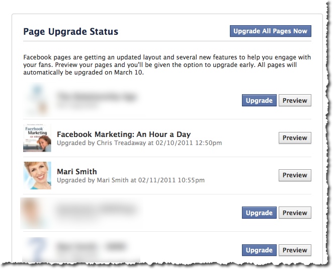
First, I strongly recommend that if you have not yet upgraded your Page, you need to dive in and do so right now!
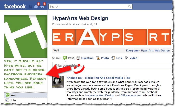
New five-photo strip at the top of Pages
This new feature is identical to the new Profile design. Your five most recently uploaded Page photos are displayed at the top and will change any time you load new photos. Photos loaded by your fans and other Pages will not appear in this display. To remove a photo from the display, mouseover and click the “x”. Hidden photos will still be accessible.What’s really cool is, just like your personal profile, you can get creative and use this valuable real estate for branding, special offers, tips, etc.
However, the photos do not stay in the same order (unlike Profiles). With each visit/refresh, the photos randomize. In the example above, Tim Ware at HyperArts Web Design mentions in the main Page image that they know the order is random. I refreshed Tim’s Page umpteen times and still couldn’t get the images to spell HyperArts. lol!
So, creating a sequential five-photo banner won’t quite work. (I’m not entirely sure why Facebook included the randomize feature. Perhaps so we can’t quite fully add a custom banner. Hm.)
Continue reading for my magical marketing tip, though!
New Photo Viewer Lightbox
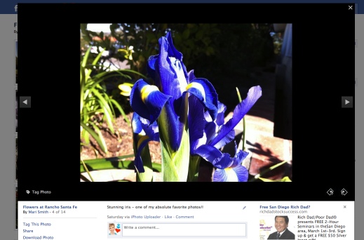
We saw a sneak peek of this lovely feature back in December. Each photo throughout the entire Facebook platform can now easily be viewed in a popup lightbox so you can see enlarged pictures, scroll back and forth, like/comment and never lose your place on Facebook. This is an extremely handy feature when viewing photos in the News Feed, on anyone’s Profile or Page, etc.Magical marketing tip: put CTAs on your images to make them ads!
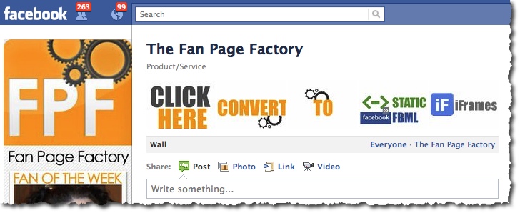
Now, here’s the magical marketing tip: create a series of photos with special offers and calls to action (CTAs) right on the images and you basically have your own five free Facebook ads!!Any images of links (URLs) will, of course, not actually click through to the web page. BUT, when anyone clicks on the five images at the top of your Page (or anytime you share an image on your wall, load to an album, etc), they see the image pop up in the lightbox where you then have your compelling offer.
The ideal dimensions to make sure the thumbnail size shows properly is: 970px by 680px. Facebook then makes the entire image the thumbnail size, which is 97px by 68px. In the Fan Page Factory screenshot above, my buddy Nathan doesn’t have CTAs on each image, but he does have a compelling offer under each photo. Props to Nathan for the tip on the dimensions-to-thumbnail ratio! Quote:
If the ratio is not (1.426=97/68) Facebook will NOT render the entire photo as the thumbnail and will rather recenter the thumbnail and only show “out” until the ratio is met.I recommend that you create at least five images like this, each with special offers and clear, “CLICK HERE” type of CTAs. Periodically change the images and offers. Each time you post a photo (photos tend to get the highest EdgeRank in the News Feed), your post goes out into the feed of fans and other pages that have liked you.
You might also check out the photo template made by ShortStack Labs.
550 new subscribers in less than 24 hours!
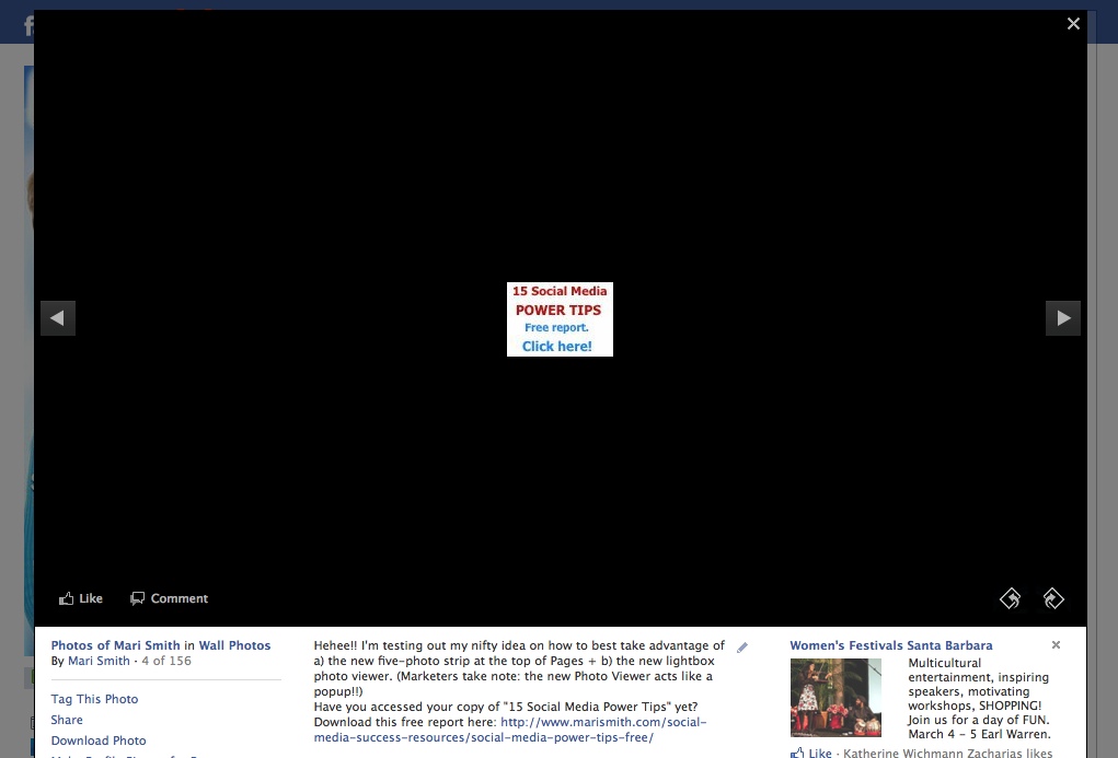
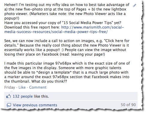
I tried the image-with-CTA experiment last Friday and uploaded a real simple 97px by 68px image (size of the thumbnail – I didn’t know at the time to make it 10x!). Within 24 hours, I had over 550 new opt-ins for my 15 Social Media Power Tips! I saw many fans shared the same photo on their page/profiles. Which, of course, creates a viral effect for the offer!Though the image looks teeny in the Photo Viewer, it’s the proper size for the photo strip at the top of my Page. But, clearly, size didn’t matter!
Initially, I put the CTA in the narrative first followed by an explanation of my experiment. But, I edited the narrative so my usual, bubbly style showed first. I didn’t want it to suddenly come across as pushy/salesy in the News Feed of my fans. It’s important to remember whatever narrative you add to the photo will be what shows up in the News Feed of your fans.
Here’s the next offer I’m sharing via Facebook Photos:
Would you like to spend 2.5 days with me – either LIVE in person in sunny San Diego, or VIRTUALLY via streaming video access – and begin to master Facebook marketing? April 1-2, optional Beginners Bootamp on March 31. Check out my fab new page for this event, just unveiled today! http://weekendwithmari.com. If you’d like to attend live, save $500 on the 1 or 2 ticket price! Just enter ’500discount’ on the check out page.So, what do you think? Will you use your five-photo strip strategically for images with offers and calls-to-action? I’d love to see some creative examples – feel free to share in the comments below and include a link back to your Facebook Page!
- Post to Facebook
- Post to Twitter333333333
- Add to LinkedIn
- Post to Delicious
- Post to StumbleUpon
- Post to Digg
- Add to Tumblr
- Send via E-mail program
- Send via Gmail
- Add to Google Bookmarks
- Add to Reddit
- Add to FriendFeed
- Post to Identi.ca
- Add to Plaxo Pulse
- Add to Evernote
- Add to Squidoo
- Add to Technorati Favorites
- Send via Yahoo Mail
Hello fellow Twitter user! Don't forget to Twit this post if you like it, or follow me on Twitter if you find me interesting.
Powered by WP Greet Box WordPress Plugin
Post Category Relationship Marketing
Showing 50 of 52 comments
-
MikedHi Mari,Regarding the 5-image bar...I can see that there is a way to exclude images from appearing by clicking the small x that appears in the top left corner when you hover over them. With more than 1000 images on my fan page however, this gets old fast. So is there a way to ensure that only the images I specifiy appear there?



I thought I should let you know about this company I came across. Right now, they are actively hiring people who know how to use Facebook, Twitter, Pinterest or Instagram.
ReplyDeleteIf you fit the profile, then you can make great money doing this, as is explained here:
https://socialsalerep.com?hyden1024